React Weekly Availability Calendar
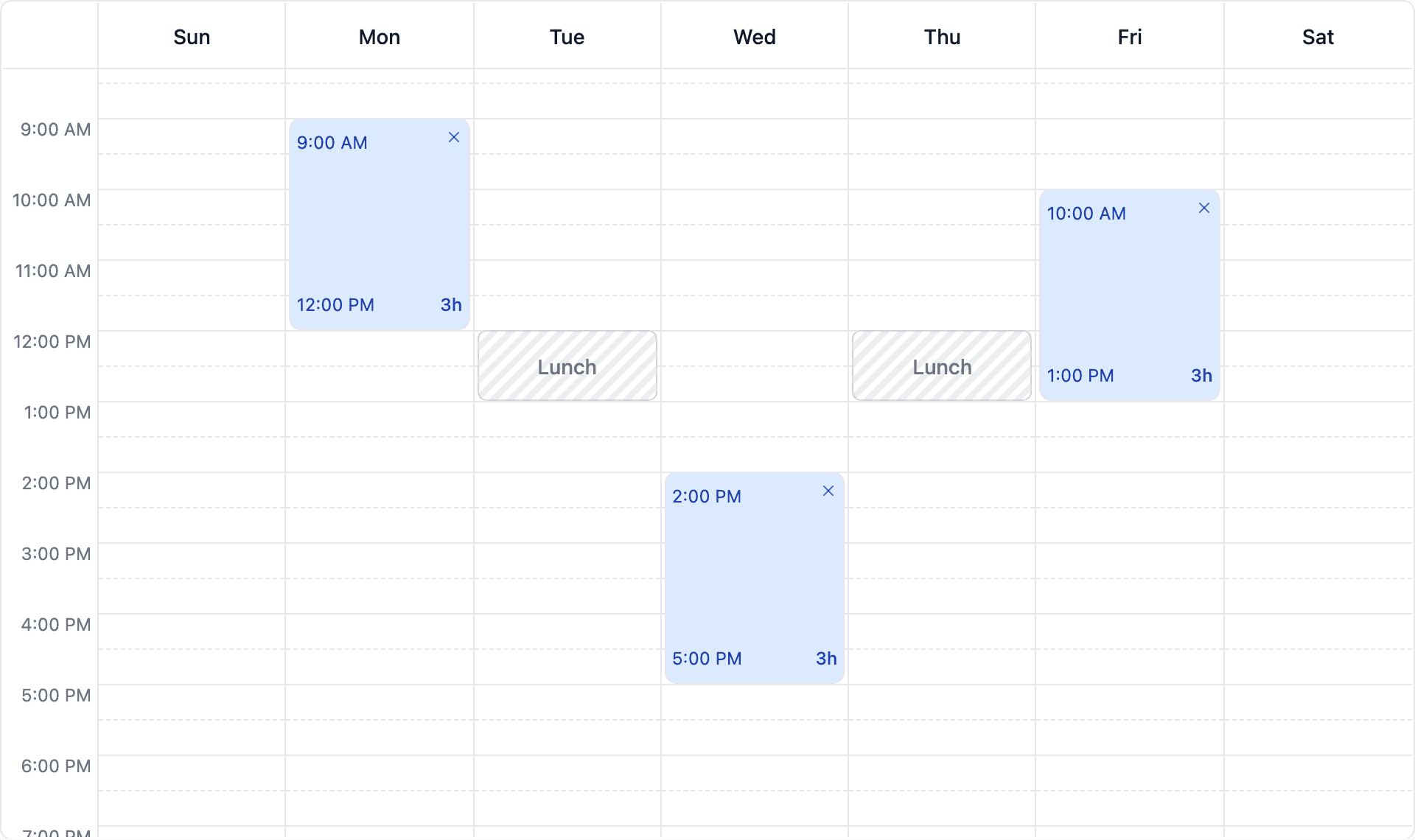
react-weekly-availability-calendar is an MIT-licensed React component published on npm. It renders a weekly grid where a user drags to create an availability slot, then resizes or moves it, with a configurable snap increment of 10, 30 or 60 minutes. Blocked ranges render as a striped, non-interactive overlay. Appearance is controlled three ways — a theme object of CSS variables, per-part class names for Tailwind or plain CSS, or render props for full control of a slot's contents. It ships with no runtime dependencies at all; React and React-DOM are peer dependencies, and the styles are injected at runtime so there is no CSS file to import. It is written in TypeScript and safe to render on the server.
An MIT-licensed React component for picking weekly availability: drag empty space to create a slot, drag the slot to move it, drag its edges to resize. It has no runtime dependencies and ships in about 16 KB gzipped. Most of the work has not gone into features — it has gone into the two things a drag interaction quietly gets wrong: state that changes underneath a gesture, and an accessibility story a mouse never tests.
- Role
- Author and maintainer
- Timeline
- Apr 2026 — ongoing
- Team
- Solo, with one outside contributor
- Status
- Published on npm, v1.5.0
The problem
Every product that asks when are you available? builds this grid again — booking tools, clinics, tutoring, shift rotas. The grid itself is easy. The gesture is not.
A drag has to resolve a pixel to a day and a minute, snap to an increment, refuse to overlap what is already there, and keep doing that on every pointer move while the array underneath it is being rewritten. Built once under a deadline, it works for the mouse of the person who wrote it and is never touched again.
This is the small, boring, genuinely reusable part of that. Publishing it means the failure modes get found once rather than once per product.
npm install react-weekly-availability-calendarWhat it is
A controlled component: slots in, onSlotsChange out, and the consumer owns the state throughout.
Drag to create, move and resize against a configurable snap increment. Blocked ranges as a striped, non-interactive overlay. One drag can lay the same range across several days. A visible-hours window, disabled days, and minimum and maximum slot lengths — where a gesture that breaks a limit is clamped to it rather than discarded, so an imprecise drag still produces a slot instead of nothing.
Styling has three levels: a theme object of CSS variables, per-part class names, or render props for a slot's entire contents. Day names and times come from Intl, so a locale prop is the whole of localisation. Undo and redo are a separate hook wrapped around the controlled pair.
No runtime dependencies, styles injected on first render so there is no CSS file to import, "use client" in the published bundle, and safe to render on a server.
Where it got hard
Resizing a slot until it touched its neighbour froze the drag. No error, no warning — the slot simply stopped following the cursor.
Adjacent slots merge: two touching ranges become one. That merge was running on every pointermove, and a merge keeps only the earliest slot's id. So at the instant the resize made contact, the id the gesture had been tracking stopped existing. Every subsequent pointermove looked up its subject, found nothing, and returned early — which looks exactly like a frozen drag and reads, in the source, like a function doing its job.
The fix is one line of scheduling: merge once, on pointerup. The reasoning sits in a comment above it, because the next person to tidy this file will reach for the same mid-drag merge.
The underlying shape is worth naming, because it recurred. A gesture holds a reference across frames while the state it points into is free to be rewritten. The same class of bug had three refs being assigned during render — one of them written mid-drag — where React is free to discard or replay a render, so a discarded render could clobber in-flight drag state with slots that were never committed. Those moved into effects.
The bug that inspection could not find
Below the 768px breakpoint the day columns are pinned to a fixed width while the grid element still stretches to fill its parent. The function mapping a pointer's x-coordinate to a day divided the grid's width by seven. Below that breakpoint the two disagree, so the buckets stopped lining up with the real columns: a pointer over one day resolved to the day before it, drifting a full column by the fourth.
Nobody was going to find that by reading. jsdom would not find it either — it returns zeros from getBoundingClientRect, and every calculation in this component is built on that rectangle. Testing a drag against a DOM with no geometry tests nothing.
So the interaction tests moved into real Chromium under Vitest's browser mode, and their first run produced this bug. It had shipped in every release up to that point. The function now hit-tests the column elements directly, and 46 of the 151 tests drive an actual browser.
Accessibility, in three passes
This went in three stages, and the middle one is the stage most projects skip.
First it claimed things it did not do. The root declared role="grid" with no row or gridcell descendants, and the resize handles declared role="separator" while being unfocusable. Announcing a grid with nothing navigable inside it is worse than declaring no role at all. Removed.
Then it did them. Full keyboard operation: Enter on a day column adds a slot at the earliest free time, arrows move it, Shift with arrows resizes from the end edge, Delete removes it. Every change is announced in a polite live region, and a move that would collide is refused and announced rather than silently dropped — a silent refusal is indistinguishable from a broken key.
Then the keyboard support turned out to have introduced three new violations. Day columns were focusable buttons containing slot buttons, which were themselves buttons containing their own remove button — nested interactive controls, which confuse both screen readers and focus order. Read-only columns carried an aria-label with no role, which ARIA prohibits. The scrolling region was not reachable by keyboard, so content out of view could not be scrolled to. axe now runs against six configurations in CI, so the next regression is caught by a machine rather than by me happening to look.
One omission is deliberate: there is still no role="grid". That role wants row and gridcell descendants across the whole surface — over a thousand cells at a ten-minute snap — which would leave a screen-reader user traversing all of them to reach four slots. Slots and columns are exposed as labelled controls instead. The correct role is sometimes the one you decline to use.
Key decisions
Zero runtime dependencies, styles injected at runtime. The alternatives were a CSS file the consumer imports — which breaks differently in every bundler and framework people actually use — or a styling library, which is not a small component if it drags a peer dependency behind it. The cost is real and I would rather state it than hide it: theming goes through CSS variables rather than a class API, and one <style> tag is appended to the head on first render.
Controlled, always. Slots live in the consumer's state and never in the component's. Undo and redo are a hook wrapped around that same pair, so history composes with the consumer's state rather than competing with a second copy inside the component.
Deprecate rather than break. Two exported constants were named for a domain this package has nothing to do with — a name that outlived the product it came from. Renaming them was right; deleting them would have broken every existing import for the sake of my own tidiness. They remain as aliases carrying @deprecated, with removal scheduled for the next major.
Draw the gridlines once. They were repeated inside all seven day columns and identical in each — 1,008 nodes for a full day at a ten-minute snap, now 144. Rendering is unchanged: the shared layer sits beneath the columns, so their borders still paint over it.
What I'd do differently
Browser tests from the first commit. They arrived at 1.2.2 and immediately found a bug present in every release before it. For a component whose entire behaviour is geometry, jsdom was never going to be sufficient, and I knew that before writing the first test — I wrote it in jsdom anyway because that was the faster thing to set up.
Ship the accessibility with the interaction, not after it. Removing the false ARIA roles and adding real keyboard support should have been one release rather than two. In between, the component was honest about what it could not do, which is better than lying about it, but it still could not do it.
Technologies
Key Highlights
- Zero runtime dependencies
- MIT licensed, published on npm
- Keyboard operable, axe-tested in CI
- SSR safe
- TypeScript first
The component
Out of the box
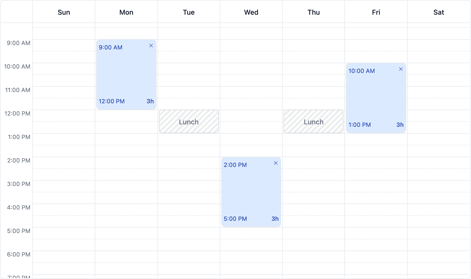
Default theme, 12-hour labels and blocked ranges shown as a striped overlay.
Customised
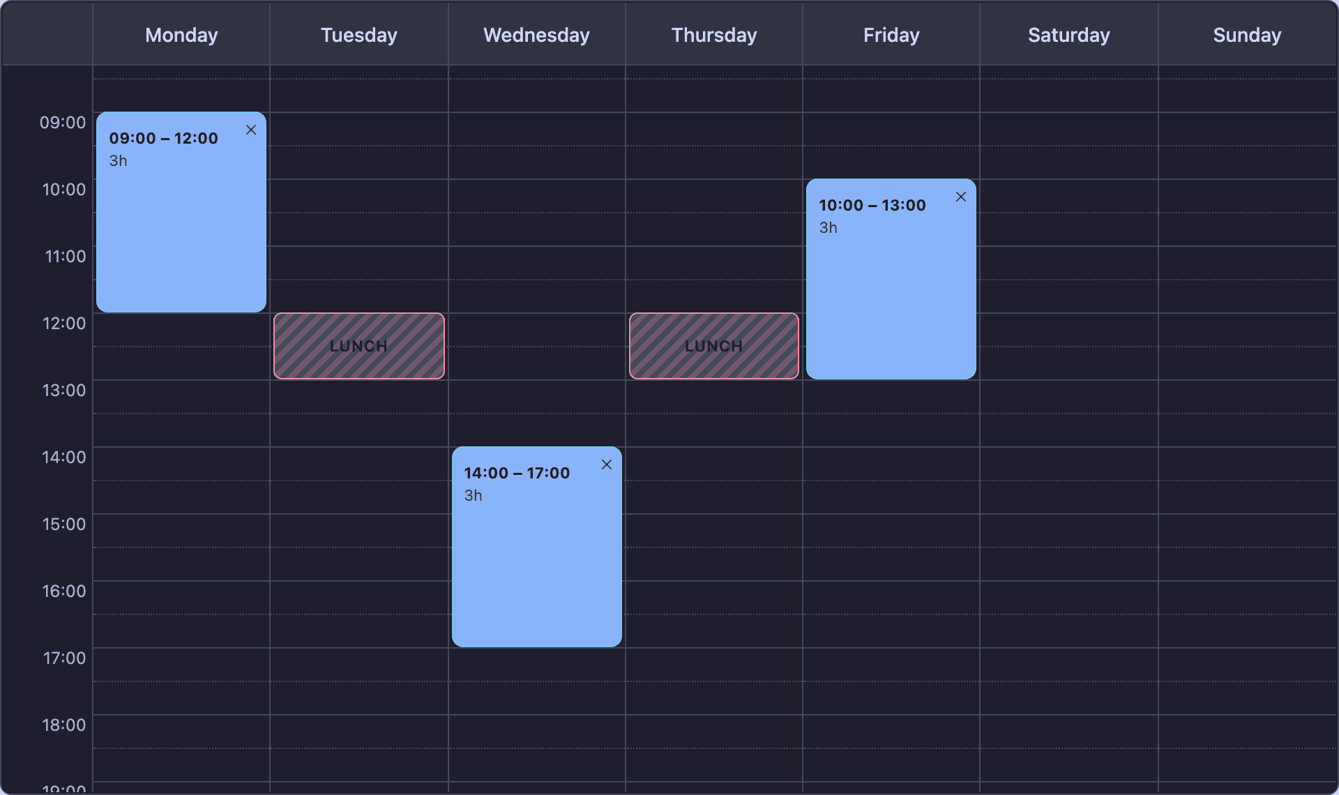
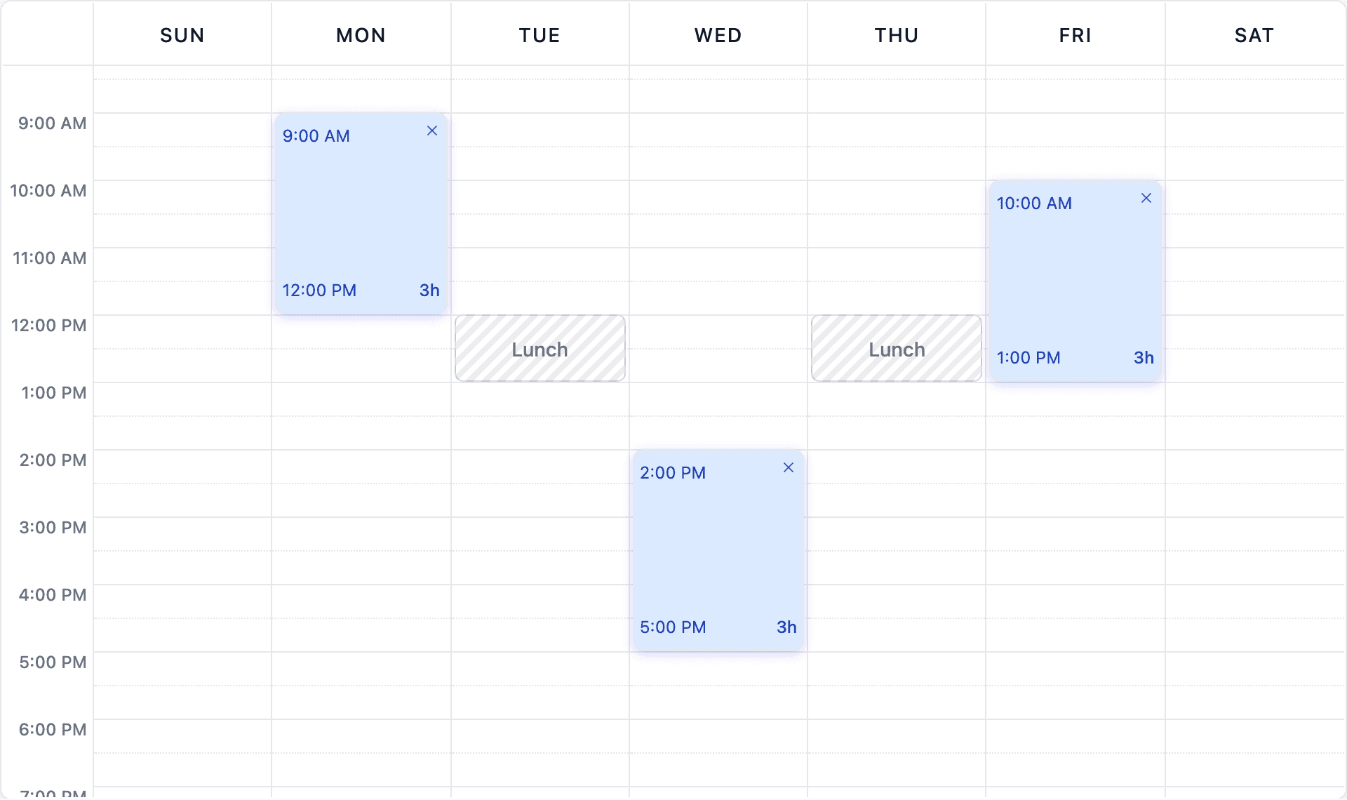
The same component with a theme object, per-part class names and a render prop for slot contents.
Interaction
onSlotClick fires when a slot is clicked without dragging, and still fires in read-only mode.